Back to the Mac, part 3

Occasionally I try to remember things I used to write about. Recently I’ve become unemployed, and thus re-visited my custom Mac install. The strangest thing about frequent startup failures is that I am left with a plethora of computers.

Here, then, are my thoughts on software for them, updated to the Spring of 2020. It’s as good a thing as any to write about instead of thinking about the world situation.

Due to the above circumstances, I have two Macs, a much-loved and little-used 13” MacBook Pro 2015, top of the line, bought second-hand when I left my job and started consulting in 2017. I love that laptop, the last MacBook Pro with ports, a magsafe power adapter, and a good keyboard. It is still my favorite Mac ever made, a title I hope it doesn’t hold forever.

The other Mac is the kind of gift we hope not to get. A 2016 13” Touchbar MBP, it has the absurd specs of a well-funded IT department, 16 gb of RAM and a 1 TB SSD, the kind of specs that seem good now but were quite expensive when it was handed to me my first day at Anki in May 2017.

As to the install I still espouse minimalism, and try to go long periods of time without touching the defaults just to see if I can. The most amusing part of the prior list is how little it has changed in seven years. The sad part is the explosion of messaging clients, a poorly-maintained and fragmented app situation I wouldn’t wish on my 2013 self who only had to hate the odd interactions between Skype and Lync.

  1. Dropbox - I’ve started paying for Dropbox, after a decade of being a free user. Support what you love, I say, and after using Google Drive, One Drive, and Box at various startups over the past few years, I really love Dropbox.
  2. 1Password - There’s still an app-only purchase, not a subscription, and so that’s how I continue to use it, sync’d to Dropbox. A must either way, and I hope the recent VC cash infusion doesn’t change the company.
  3. Little Snitch - Still perfect, still made by a small German company, still an early part of my Mac set up
  4. Office - As before, installed only for Excel, which remains my must-have work app.
  5. LaunchBar - On work Macs I skip this, just to see, but once the Mac becomes mine eventually LaunchBar is necessary. Every time I’m shocked I lived without it. More than 15 years now of being a critical app.
  6. Fantastical - Again, installed mainly for the menu bar item.
  7. Ulysses - Now a Mac App Store version, still where everything I write, including this post, starts.
  8. 1Blocker - As far as I can tell this is the best Safari ad blocker.
  9. Soulver - I really love this app, a quick calculator that somehow is smarter than Excel and simpler than a calculator. It’s one of my top 5 iPhone apps, and the new version 3 for Mac is incredibly nice.
  10. ExpressVPN - Living abroad and spending a lot of time in China, a VPN is mandatory. Express is the best I’ve found for the situations I’m in, and I’ve been a customer for years.
  11. Slack - I use this begrudgingly due to it’s huge resource load, poor adherence to Mac standard interface items, and awful propensity to take over focus repeatedly on launch.
  12. Zoom - Likewise begrudgingly used due to their horrible security, propensity for hiding useful preferences on a web page, and willingness to sacrifice everything for growth. This shouldn’t be a surprise, there’s an entire job in Silicon Valley called Growth Hacker’.
  13. Signal - While not perfect, Signal is excellent and getting better every day. The only app I proselytize now.
  14. Whatsapp - Another annoying Electron-based chat app that unfortunately is the social mainstay in Hong Kong.
  15. Wechat - The worst of all the chat apps in terms of adhering to good design principles, but likewise critical for conversations with suppliers and friends in China.
  16. Tweetbot - I use Twitter a lot less lately, but Tweetbot is still the only functional way to do so.

There are others, edge cases, but those are the apps on this Mac that see regular use. What has changed since 2013, when I wrote the first version of this list? Two big things:

  1. Most of the software I love I pay for. The first 10 items on this list all cost me money. This, in my 2020 opinion, is a good thing, as it means the people may still be making it when I update this list next. For a lot of these apps I’ve been paying for a long time. I started using Ulysses in 2003, LaunchBar in 2006 if not before, 1Password, Fantastical, and Soulver in the iPhone era.
  2. Chat apps are the problem. The list above contains 5 chat apps, all of which overlap in functionality and are on a system which already includes Messages and Facetime, both of which I use regularly. The swelling of this category was hard to predict in the Adium era of standards-based services that could be aggregated. I desperately wish the same were still true. Without much hope for that, I’m working hard to move my life to Signal/iMessage for personal, and Wechat for China. Whatsapp/Slack/Zoom remain a must due to Hong Kong and work, but I’d prefer to abandon all three. Unfortunately I hold out little hope for this category’s improvement, given the drivers behind each app’s growth.
The future in 2G

A lot of my job is done abroad. This year I spent almost two and a half months abroad, 73 days all told. Being out of the States so often and for so long, cumulatively, gives me many opprotunities to learn and to remember things I’ve forgotten since moving back to the US in 2008. I really appreciate these chances, even if some of them are lonely, or represent significant challenges at work. Enough are interesting and for personal adventure to keep me happy, and keep me traveling.

2014 brought one specific change to my travel methods, and because of that an experience I wanted to share. I no longer use local SIMs, save in extraordinary situations. In October of 2013, T-Mobile, an American mobile phone company, launched free international data roaming. Even now, more than a year later, typing those words feels amazing. Free international data. To give context, previous international data deals available in the US ran something in the realm of $30 USD for 50 megabytes of international roaming data. Thirty dollars for fifty megabytes. It’s easy to see why I switched to T-Mobile.

The catch, because of course there is one, is that this free and unlimited data comes down from the tower at 2G speeds.

So I spent one fifth of 2014 on 2G, and the remaining four fifths on LTE. Or with no service in the wilder parts of the US, specifically northern California, north western Colorado, and a lot of the cross-country train ride. That is another trade-off that comes with chosing T-Mobile. It’s an easy choice for me, being primarily a city person.

Having free international data and spending so much time on the road, be it in the trains of Hong Kong, Shanghai, and Tokyo, or the traffic of Manila and Shenzhen, not to mention factories, restaurants, and hotels, means a lot of phone time. A lot of email. A lot of Twitter. A lot of web. And that leads to the point. In 2014, the web is hard on 2G. Sites load slowly, first displaying banner ads and only then, tens of seconds later, the all-text content of the article. Mastheads take dozens of seconds to load, complex drop down menus and high-resolution logos. Analytics packages. And ads. Some activities and apps simply don’t scale well to 2G. Instagram, for example, is an exercise in patience, but a worthwhile one. And Google Maps, well…

In 2014 it feels like the network is finally everywhere, or almost. And it feels like the future. Being able to turn on my phone in any country on landing and check on my cat, at home in San Francisco, will probably still feel surprisingly wonderful for another couple of years. And 2G isn’t bad for most things. Despite how it probably sounds, this post is not meant as a complaint. It’s meant as a note, a reminder, and a future consideration. For example, loading time for maps matter. More than anything, maps are used when in unfamiliar locations, and often those are situations without great network access. Be it hotel wifi, 2G cell network, or just the slow connections of many smaller cities, maps are most necessary on the fringes, out of our comfort zone, and often in something of a hurry. Yes, most of the places I’ve been have faster networks. Hong Kong has excellent service, faster than the US in many cases. But not every place does. Not every city has LTE, nor every carrier, and that’s the point.

I view these 73 days on 2G as a test of how we interact with networks, and as a challenge for service design. Twitter as it used to be, all text 140 characters or less, was the perfect low-bandwidth mobile-first service. Modern Twitter, with video, photos, expanded links, and soundcloud embedded, is increasingly something built for fast networks, for always-on connections. Not necessarily a bad set of decisions, but a definite shift from a service originally built on SMS, built for the mobile networks we used to have and that many still do.

Of course not all things are built for slow mobile networks, and that’s fine. Heck, Tumblr is one of them, image heavy and full of .gifs. Oh god, .gifs on 2G. If ever a format’s resurgence has come without consideration of bandwith, .gif is it.

Overall I think a few weeks on 2G is something product teams should experience, and consider, not just today or this year, but well into the future. There will be people on slower networks and with worse connections for much longer than San Francisco, which had quite poor cell networks just a handfull of years ago. If a service is designed to change the world” it needs to be usable out in that world.

Apple Maps, China, and iOS 8

Since iOS 6, Apple Maps has always displayed different mapping information for China depending on the user’s location. In China, Maps displayed data from AutoNavi, which was quite good but tile based rather than vector based. Users outside of China see very bad (incomplete) vector maps similar to Apple’s US information, though with such low quality that cities, rivers, and other basic geographical features are missing, making the maps unusable.

In iOS 8, Apple claimed they were delivering better China maps, including vector-based design. They did this, and the maps are much better. Geographical features, locations, cities, roads are all rendered quite well, or at least quite well in my limited testing (Beijing, Shanghai, Changsha, Dongguan/Shenzhen, and a couple other cities). Unfortunately, these maps display strange data for the rest of the world. Hong Kong, for example, has good mapping info when viewed from the US or Hong Kong, but horrible data when viewed from within China. San Francisco’s data, viewed from within China, is much worse than when viewed from the US.

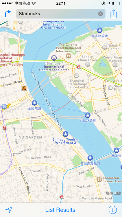
Below is an example of Lujiazui in Shanghai in iOS 8, served from China. My earlier post, here, shows what the maps look like when viewed from outside of China.

Unfortunately, users outside of China see the same awful maps as before. For example Shanghai has no river, and the area between Shenzhen and Guangzhou is a blank section of map. Most of China is a blank section of map, including urban areas.

So here’s my question. How do we get Apple to serve us the best maps for each location, regardless of where the request comes from? I work in China frequently, and live in the US, and would like the best info for both. I’m sure others would as well, and unifying the maps would definitely make Apple’s Maps more competitive with Google, which serves better info for both places regardless of the request’s origination point.

Back to the Mac, part 2

Another week has gone by, and I’ve been forced to install Flash. For work. Our primary freight company’s online shipment request form is entirely Flash.

There’s an iPhone and iOS app to do the exact same thing, but the web version is Flash-based. Strange decisions there.

Along with Flash I installed the useful but horribly spelled Safari extension ClickToFlash, to stop auto-play video/ad sites. Highly recommended, especially because it forces sites to serve HTML5 videos instead of Flash if possible (useful on Youtube and assorted other sites like the Daily Show, etc, that use Flash on the desktop but support HTML5 video players for iPad and other mobile browsers).

So the current additions:

  1. Flash

  2. ClickToFlash

  3. Skype (yes, owned by Microsoft, no, doesn’t interoperate with Lync, yes, necessary for business in Asia)

Also, I’ve been asked about 1Password and Fantastical and the upcoming OS X Mavericks. I always hope the next OS will obsolete a few of my productivity” apps. Growl left with Notifications. LaunchBar is tested by Spotlight. Messages replaced Adium, and before those there were others. Developers have great ideas, and those that should be adopted are. I’m all for it.

Back to the Mac, part 1

Two weeks ago I switched back to a Mac (MacBook Air 2013 13 inch) at work. I tweeted as much and was asked for my install checklist for a new Mac. As the IT support for my office (and home), documenting my steps and thinking is a good idea.

First, I am firmly of the lighter is better” category in terms of software installs, preference tweaks, and other edits. My feeling is the less tweaking I do, the fewer conflicts I’ll introduce, and more importantly the less I’ll have to remember. Also, although it’s not an every day scenario, the faster I can get a new machine up and running the better. So each new install is an opportunity to test how much I really need any single piece of software. As I don’t get new computers (at home) that often, this is also my chance to evaluate whether OS updates have made 3rd party software redundant.

As a result of this type of testing I don’t change the OS X defaults for scroll direction, button colors, or menu bar transparency. I’ve gotten used to them all in previous updates, making for fewer settings to flip. The only customization I do is to Safari tabs, using Keyboard Preferences to set Command-Option-Right and Command-Option-Left to Next Tab and Previous Tab respectively. The defaults don’t work for my fingers. I also use the text line selection shortcuts (Command-Shift-L/R) all the time, and the two integrate well.

To start with I have two accounts logged in with System Preferences: Exchange (work) and Gmail (personal). Everything else can wait. To avoid one extra install I’m trying to use Mail, Calendar, and Reminders instead of Outlook. One less app to manage, and Outlook’s crashing was one of the big reasons I ditched the PC at work (having always had a Mac at home).

As a result of the above, my day one install list was incredibly minimal:

  1. Dropbox - gets installed first because it holds my 1Password backup

  2. 1Password - access to everything

  3. Little Snitch - inbound & outbound traffic monitor

  4. Office - Excel alone is probably enough for me

And that was it. I used the computer for two days this way, at work and at home, trying to see what else I needed for work to integrate with the all-Windows environment there. On the personal end, I was holding off on everything as this is a work-first machine. At this point I had neither Flash nor Java installed, and hadn’t launched iTunes.

So here’s my added install for work, with Office already on the machine:

  1. Windows Server Launchpad - to connect with Small Business Server Essentials 2011, works flawlessly on OS X

  2. Microsoft Lync - Hopefully Microsoft continues to unify products and Skype becomes the default MS messaging client soon

  3. Chrome - for Flash player

  4. GoToMeeting client - poorly named but functional

Two more days and it was weekend time. I’d gotten into a pretty good routine at work, using two monitors, Mail, Lync, Excel, Safari, and Calendar relentlessly. So far the Mac transition has been all upside, with faster boot in the morning and less time relaunching Outlook.

For personal use what did I miss? Surprisingly little. But after four days, I was done testing Spotlight. It’s better than the last time I’d tried (Lion) but I want something that remembers my search terms and allows me to Google from the keyboard.

Final personal use installs:

  1. Amazon MP3 Downloader - I buy almost all my music from Amazon and then match it into iTunes with iTunes Match for cloud sync

  2. LaunchBar - This is usually the first Mac app I install, and it still should be. Spotlight can’t really compete, and I use only a handful of the abilities. Amazing that two of my top ten apps come from the same small German company.

That’s it. I’ve got all my work data and my music on this computer. I’ve got Office, search, meetings, server connections, and my own passwords and essential data. The computer’s good to go.

Almost.

After another 2 days I added two apps from the App store (that I already owned) to make my personal use better:

  1. Ulysses III - This is my main writing app, and I love it.

  2. Tweetbot - I like Twitter, but without this app only use it on my phone.

Another day at work and I added one more thing, specifically to handle the display of tasks from Exchange. I could use Microsoft’s My Day app, which comes with Office, but then it launches Outlook, which I’m trying not to use. Task display will probably determine my success with avoiding Outlook on the Mac.

  1. Fantastical - A menu bar calendar, task list, and quick input method. Available from the App Store though I already had a license. I had hoped to avoid installing this, just to reduce clutter, but it’s a great app.

Two weeks later I still haven’t installed Java or Flash player, outside of Chrome.

The amazing thing about this list is both how much has changed and how little. In 2006 I got the first Intel-based Mac, the 15” MacBook Pro. Hot as hell and bigger than I need in a computer, but a great step up from my 2000 (Pismo) PowerBook.

In February of 2006 Twitter, Dropbox, Amazon MP3, and Chrome didn’t exist. 1Password would come out a few months later. But Little Snitch, LaunchBar, and Ulysses were among the first apps I installed.

When I think of that, installing LaunchBar on 10.4 Tiger on that brand new Intel Mac in 2006, it makes me smile. I wish I had a list of my set up steps for that machine.

iOS 7 wishes, part 1

Monday’s Apple keynote will reveal iOS 7. Many are hoping for big fixes, a total Ives-led overhaul. Not me. Sure, I’d like a much better sharing system, a looser grasp on default apps, and a faster update speed to the cloud-based Maps/Siri. But those are wishes, and I like to ask for specifics.

I’d like to see 3 annoyances fixed. That’s all. Here’s the first:

image

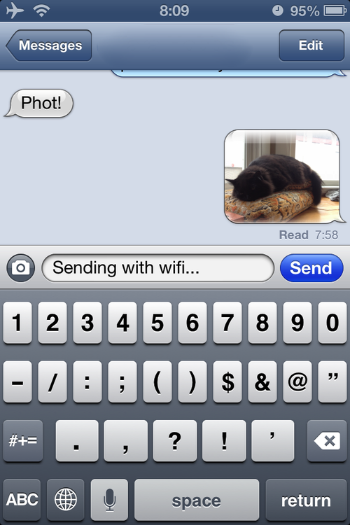
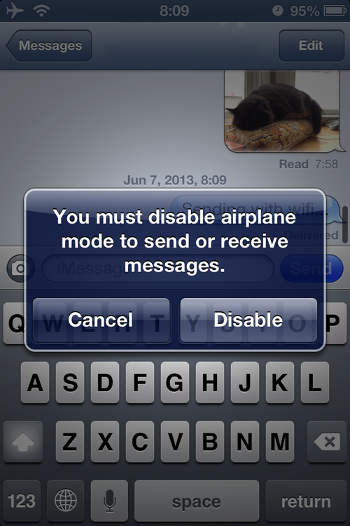
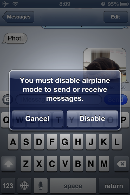
Open Messages in airplane mode but with Wifi on, and this alert appears. Not only is it annoying, it’s not true. Messages works on wifi, like so:

image

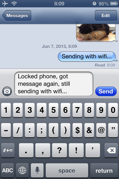
And it gets worse. Lock the phone, unlock, and re-open Messages:

image

Same alert. Not only is it not true, but it appears every time Messages is opened after locking the phone. And, of course, Messages still works over wifi:

image

All I’d really like from Apple in iOS 7 is an improved attention to detail. Strange to say, for a company famous for it.

A letter to Apple part 1, iTunes Match

I have a smart playlist that is called 2012” and, as you might have guessed, contains songs released in 2012.

I have iTunes Match.

It appears as though I can simply download that playlist to my iPhone to have all the songs I own that were released in 2012 on my iPhone.

This action does not work. That’s because the playlist, when viewed through Music on my phone, contains 300 songs. Here are some questions:

Why? I don’t know.

Does it contain only songs released in 2012? No it does not.

What does it contain? A random sample of my library.

Random how? Random in that I can not figure out any thing those songs have in common.

Were they released in the same year? No they were not.

Are they by the same artist? No they are not.

Are the songs in the playlist on my iPhone the same as the songs in the playlist in iTunes on my Mac? No they are not.

What do we call this? An example of how poorly iTunes Match handles multiple devices.

What else might we call this? A broken service.

Broken how? Broken in that it does most emphatically not just work.

Why is that important? Because that’s what Apple is famous for.

Why is Apple famous for that? Because before attempting such complicated internet-related-things like Siri, Maps, and iTunes Match, Apple’s combination of software and hardware often just worked” in a way that its competitors could not match.

Why was this good? Because it made people purchase Apple hardware.

What has happened in the interim? Well, much like my problem with iTunes Match, no one knows.

Why is this? Because there is no feedback to the user, no master control list, and no way to resolve the problem.

Why is this? No one knows. But it sucks.

iPhone 4S thoughts, part 1

A preamble: Given the current uncompetitive US cellular climate and relatively atrocious level of service provided by all of the major players, a major goal of mine remains minimizing the total dollars given to my cell provider. If this is a shared goal, the optimal time for cell phone replacement, on contract, at subsidized rates, is the first moment possible.

To clarify: Apple sells unlocked iPhones for $650. AT&T sells locked iPhones for $200. That means AT&T purchases iPhones at some rate slightly lower than $650 and subsidizes some amount less than $450 to each customer to entice them into a 2-year contract with a total value somewhere north of $2,000.

This means for every iPhone sold, AT&T pays Apple up front, and earns it back over time. When the subsidy has been recovered, usually between 18 and 24 months, AT&T begins offering its customers new phones at fully subsidized rates in exchange for signing a new contract.

Because the user’s monthly bill does not decline once their subsidy is paid off, AT&T’s profit increases immediately for every customer who continues to use their old phone after it is paid off.

Thus, to avoid paying AT&T any extra money, AT&T customers should upgrade immediately upon being able to receive a full subsidy again.

Hence, 16 months after standing in line for an iPhone 4 at launch day, I have an iPhone 4S.

Letters to the FCC part 1, AT&T and T-Mobile

The purchase of T-Mobile by AT&T would be bad for consumers in the US for the following reasons.

Currently, T-Mobile is the only carrier that sells and supports unlocked phones.  This means that any GSM phone, which is most of the phones world-wide, will work on T-Mobile’s network. AT&T uses a software lock in their phones, like the iPhone, so that they can not be used on another network despite being GSM phones. This choice can be seen in only one light: an attempt to restrict consumer choice, and is an example of the kind of anti-consumer, anti-competitive behavior AT&T already exhibits, and a reason why they should not be allowed greater power in the US wireless market.

Also, T-Mobile is the only US cell provider that charges a lower fee for a contract that does not come with a phone. AT&T has incredibly high pricing (in line with Verizon, but higher than any other country in the world) which suggests collusion among the 2 largest US carriers and another reason to maintain several consumer options. In addition, AT&T’s high pricing is defended by the company as hardware subsidies for consumers, allowing them to purchase new phones at a fraction of the true cost through a subsidy repaid during the life of the contract.  However, AT&T’s contracts that do not include hardware cost, on a minute by minute and text message by text message, the same as their subsidy containing counterparts.  T-Mobile, as of this writing, offers a package for $70/month that includes a phone and the same package, sans phone, for $50/month, leaving the consumer with a clear idea of the cost of the hardware subsidy ($20/month).

The fact that AT&T offers no plan including data at under $75/month indicates that they are not only colluding with Verizon to maintain pricing but that giving AT&T more leverage by removing T-Mobile, one of their few true competitors, would be horrible for the US consumer. Note that, because the phones are not interoperable, Sprint and Verizon are not true competitors with AT&T, as the consumer must buy new hardware. In other countries around the world, where all wireless providers are based on the GSM standard, switching providers is a very low cost proposition, requiring only a new SIM card and agreement, not new hardware.  This drives prices down and improves service.  In the US the differing wireless standards act as a brake on competition, hindering subscriber movement, and ultimately leading to higher prices because companies like AT&T and Verizon do not have adequate competition.  The purchase of T-Mobile by AT&T would only worsen the situation, and I urge you, even in the event that it recieves your approval, to constrain AT&T with the following requirements.

  1. All phones must be sold unlocked. With no remaining GSM competitor in the US, there is no need for AT&T to lock the phones to their wireless network.  The only reason they do this is to enable them to charge exorbitant overseas roaming fees, because the user can not simply install a local SIM card in their AT&T-provided phone.

  2. AT&T must offer bring your own phone” plans that are cheaper for daily use than the subsidy including” plans. The fact that they do not do this now is simply disgusting, because it means they believe their customers are too stupid to notice the dishonest pricing of non-subsidy plans.

  3. AT&T must remove the false charges they currently apply for incoming text messaging.  Currently AT&T charges both the sender and the reciever of a text message, a practice that has been found illegal in other countries and does not apply to any other of their services, such as phone calls or email. Text messaging has a near-zero delivery cost, and their current policies represent nothing more than rampant profiteering.

  4. AT&T should institute pay-per-use options for voice minutes, rather than requiring the user to pre-pay for a block that may or may not be used and will expire if unused. This billing practice helps no one outside of AT&T, and the fact that it is the default US (but not global) standard speaks only to how poorly our wireless carriers are regulated and how poor a job competition has done to improve pricing options.

In their current position as one of the two largest US wireless carriers, AT&T has done a horrible job supporting their customers, with high pricing and mediocre service. The acquisition of T-Mobile does not indicate a change of heart on their parts, and simply improves their pricing leverage over the US consumer.  As their chief regulator, their behavior is a reflection on your willingness to defend the US consumer.  Please, do not give them the power they seek and instead fight for broader choice and lower prices, two things that US consumers are currently at the bottom of global rankings on in the wireless provider category.

Thank you.

Palm Pre 2 thoughts, part 2

Last of it’s kind, the Palm Pre 2 arrived in December at my office, unlocked, direct from HP.

I have been asked a dozen times why, happy with my iPhone 4, I purchased a Pre 2. The answer can be found here. It was not a joke, I firmly believed releasing unlocked hardware would help Palm. The fact that it took a near-collapse and subsequent assimilation by HP to push the new corporation (HPalm?) into releasing unlocked GSM hardware does not deter me. By all accounts the Pre 2 and webOS 2 were far superior to the originals, and I was eager. The results speak both to the Palm team’s successes and to the difficulty of their chosen task.

The Pre 2 is what I consider to be the best form factor possible. While I have gotten very comfortable typing on a touch screen over the last several years, the speed allowed by a hardware keyboard can never be equaled.  I do not mean the typing speed, though that may be true. I mean the speed of access. The iPhone has a single means of access: the screen. Although the display can function as a variety of inputs (keyboard, number pad, chooser list, etc.) the phone and OS must first be told which one of those to present.  With a single swipe left from the home screen every application, person, message, and web site is searchable. The key to that sentence is the beginning, with a single swipe left from the home screen”. Without that gesture from that particular location, there is no search.

On the Pre 2, and any other device with hardware keyboard, search can simply be a function of beginning to type. Context for the display, from an unaccessed state, does not matter. On my iPhone 4 I often attempt to swipe left while in an app only to realize I have to first return to the home screen with a button press and then swipe left. Only after that is complete will I be able to start my search query.

Likewise, storing the hardware keyboard in portrait orientation, below the screen, is a fantastic fit. It means the phone can be all screen whenever possible. It also means that when the keyboard is extended the phone feels incredibly natural to hold. Landscape keyboards unbalance phones, making them unwieldy and heavy, impossible to hold in a single hand, let alone type on with one.

The Pre 2’s small screen size does not bother me after an hour or two. In fact it is the iPhone that feels large and strangely flat upon returning to it. This is a long way of saying the Pre 2 feels great in the hand and pocket, and is easy on the eyes.

However, the Pre 2 desperately needs a rotation lock. The hardware rotation lock on the iPad (prior to iOS 4.1 or post iOS 4.2) is a brilliant feature.  Turning the Pre 2 can be a surprisingly frustrating experience, because the sensor’s calibration and response speed lag slightly, meaning that one turns the phone to landscape (when reading a web site, for example), waits, returns it back to portrait and then to landscape again very quickly, and then watches as the phone performs all 3 transformations in a disjointed manner.  The odd shake” of the phone to make the sensor adjust the screen that old (pre iOS 4.0) iPhone users knew is back with webOS.

There it is then: the Pre 2 is hardware I constantly want to touch. It looks good, it feels good, and using it is, mostly, absolutely wonderful. Every time I go back to it I’m happy, and every time I leave it I miss the small shape and the clicking keys.  WebOS is a delight to use, works as advertised and has a sense of motion and organization lacking from it’s competitors, Android and iOS.  It is a wonderful platform, and something I will watch further.

Why then do I constantly return to my iPhone 4?  There are two reasons, and they revolve around the same concept, something only my time with these two phones has made me understand.

Trust.

When I have to work on my phone, which is a more and more common occurance globally, I can’t hesitate. When I’m driving to a vendor’s office or a FedEx location I googled three minutes ago, when I’m trying to call someone from a restaurant, or when I’m looking for an email with pricing I got a month ago, I have to know that my phone will do what I want.

The Pre 2 and webOS are pretty, they multitask well, their notification system is achingly simple and wonderfully functional. And when I launch Google Maps it sometimes works.  Sometimes it sits pulsing at the launch screen for several minutes, until I use the wonderful card interface to go back to my email.  When I try to call someone from my bluetooth headset and realize that I have to find their information on the phone, because bluetooth voice dial, while listed as a feature for webOS 2.1, does not yet work on my Pre 2’s webOS 2.0.1, I miss my iPhone.

When I am going out for the afternoon and look at the battery meter on the Pre 2, it often reads 40%.  At 2 pm that is a worrisome thing, something that makes me think about my charger’s location and my ability to power the phone from my car’s USB socket.

The Pre 2 and HPs new OS are wonderful things. But they do not inspire trust. Not yet. Battery life and responsiveness are two things I used not to consider critical with smartphones. They all had poor battery life and they all were a little slow to respond.  In that market the Pre 2 looks great, because the thought that went into webOS is clearly worlds above what went into most phone operating systems. That is not the current market.

I enjoy using the Pre 2, and wish I could do so more often.  I hope that webOS 2.1 brings better performance, fewer bugs, and bluetooth voice dialing, which is a deal breaker for my 45 minute commute.  Perhaps the Pre 3 will feature a more robust battery, and a more responsive mapping application. I hope so. I would love to be able to recommend webOS, to show my friends my phone and to have them be able to buy one, from HP unlocked, from T-Mobile, AT&T, Sprint, Verizon. I would like more people to see this carefully designed OS. I think that would be good for everyone.

Maybe this summer.

Until then I’ll admire my Pre 2 and use it, with my hand-cut SIM card adaptor, on days I don’t need to do a lot of work.

Problems with Translink/Clipper Card

Translink, recently renamed Clipper, is a contactless payment system for transit companies in the Bay Area.  It is theoretically usable on Bart, Muni, and for bridge tolls.  This seems at first to be a great idea.  Similar cards are in use in Hong Kong, Shanghai, Tokyo, and London, and work very well.

Unfortunately, San Francisco, sitting at the heart of the US tech industry, did not simply deploy one of these solutions.  Instead, they hired someone new, who gradually developed a system with the capabilities of those already in place elsewhere. This process was slow and involved many intermediate steps that would have been uneccessary had the city merely looked abroad before starting.

The first problem with Translink/Clipper is that the machines used to load value onto a card are only available in the downtown stations.  This means that a user with no value on their card at a non-downtown station has to pay cash fare, ride downtown, and then load their card.

The second problem is that the value adding machines are incredibly slow.  This slowness is due to their use of a dial-up modem to communicate with the Clipper computer network and perform credit/debit card checks.  A dial-up modem in the year 2010 for brand new machines installed in the heart of America’s tech industry seems not only stupid, but absurd.  Each transaction takes upwards of four minutes, and may fail if the dial-up connection isn’t established the first time.

To circumvent (not solve) these two problems, Clipper provides a service called Auto Load, where by the user can input a credit/debit card on their site and associate it with a Clipper card and money will be automatically added to the card when its value drops below $10.  This means the user does not need to go downtown or use those slow machines, though it does not remove the 72 hour transaction processing time, which is due to the fact that all trains do not dock every day, so their onboard terminals may not be updated for 72 hours and they may incorrectly reflect the card’s balance until then.  This is a problem only solvable if each terminal was networked, rather than only the downtown stations, which presents, I imagine, a significant cost barrier.  Thus the 72 hour transaction time is unavoidable.

However, the Clipper site is not without flaws.  First of all, it does not send out receipt emails for purchases.  Instead it sends out a generic email stating that You attempted some action with the Clipper website that will take 72 hours to process.”  This avoids claiming a successful process when none has yet taken place, but also doesn’t tell the user what the action was.  Also, when the 72 hours have elapsed, the user is not notified if their transaction was successful or not, and are not given any receipt of charges in either case.  This means that, without re-checking the site, the user has no way of knowing what Clipper has done.

Should the transaction fail and the card not be loaded with money, the user will not be able to board a train.  And here in lies the real failure of the Clipper system.  There is no solution to this problem.  The staff in the station can not do anything about Clipper cards.  The online phone support staff can not do anything without a 72 hour delay.  The only solution is to either use the slow value add machines if at a downtown station, thus forgoing the entire Auto Load feature, or purchase a physical ticket, proceed to a location with internet, log on to the site, check value, try again to add value, and wait for 72 hours.  If this fails or succeeds no email or notification will be sent.

In Clipper San Francisco finally has some semblance of a modern contact-less payment system.  However, because the city hired a third party to build one from scratch rather than purchasing one that had already been deployed, the system is slow, opaque to the user and completely unresponsive to support calls.  Because it has never been tested in a different city the residents of San Francisco are forced to deal with the growing pains of a company that does not consider the transit rider its priority, and whose computer systems are woefully behind the times.  Dial-up, 72 hour transaction processing, and no email confirmation of purchases are reminders of 1995 rather than parts of a modern contact-less payment system.

Hopefully Clipper will improve, because the city has invested in it without considering better options, and residents are now forced to live with that choice.

iPhone 4 thoughts, part 4

I’ve now had my iPhone 4 for several weeks, and wanted to re-visit these thoughts, to see if I’d changed my mind on anything.

First, the iPhone 4 is pretty awesome. The display is gorgeous and battery life is much, much better.  The responsiveness of the camera has me using it all the time, and the ability to multi-task, even in limited ways, is great.

The rubber Bumper case is annoying, because it clings to the fabric on the inside of my pockets, which makes the phone hard to get in and out.  This leads to me not wanting to use it, which in turn means I will have to deal with the antenna issue and the fact that I spent $30 on the case.  Apple has just dealt with the $30 portion of that problem.

Under 4.0.1 I no longer ever have 5 bars in my house.  I live in San Francisco.  Coverage has not changed.  It’s good to have a better understanding of how poor AT&T is here, and I wish I had my phone configured to display -db, as the Anandtech people do.  I’ll look into that.

The antenna issue, whatever Steve Jobs, John Gruber, et al. say, is both real and a hardware flaw.  I have now spent quite a bit of time holding other people’s iPhones, as well as the demo units in the store.  I have found phones that will drop from 5 bars all the way into Searching…” and I have found phones that, in the exact same location, will drop from 5 bars to 3 and no lower.  I do not see any way of telling them apart, other than holding multiple phones in the hand.  Note that, in order to truly tell, one must hold the phone for upwards of one minute.  In shorter amounts of time the phones look identical, as they will all drop roughly 2 bars.  Only after a longer time will some phones continue all the way down to no signal and the battery-destroying Searching…” mode.

The proximity sensor issue is also real, but very, very tricky to diagnose or understand, as it seems to only happen after the sensor has been activated.  I have only had it happen one time, where a call ended surprisingly and I looked at the phone and realized the screen was on.  I don’t spend a lot of time on the phone, making only a few brief calls a day, and encountered the issue on a more lengthy call.  I suspect this is fixable in software.

The reflective clarity of the Apple logo on the back is amazing.

The iPod app is nicer now.  I don’t use it too often, though I am starting to as I grow less afraid of my battery, but the subtle interface changes, which mostly present more details on each screen, are much appreciated.

I love being able to see the percentage of battery remaining rather than simply the icon.  This has been possible since the 3GS, but is new to me.

My best usage time on the iPhone from 100% charged to shut down is 6 hours 34 minutes of usage and 38 hours 21 minutes of standby.  That, to me, was impressive.

And, on a very specific note for one person, let me say this: don’t put your phone in the same pocket with your keys.  That would be stupid.

iPhone 4 thoughts, part 2

This morning as I was using my iPhone 4 with Bumper on in a room that normally has poor signal strength I noticed the signal dropping.  I was on wifi as well, so connectivity was fine, of course, but the bars declined in the same manner as yesterday when held without Bumper on.

I shifted the Bumper and the bars returned.  This means that, in areas where signal strength was, with the iPhone 3G, questionable, the iPhone 4 antennas are more vulnerable to the bridging interference than in strong coverage areas.  This corresponds with findings posted by others.

I then removed the bumper and the problem was easily reproducible by holding the phone in my left hand in all areas of the house, regardless of coverage strength.  I’d been debating heading back to the Apple store, and this pushed me over the edge.  I got on the bus.

When I got to Stonestown Galleria, having not used the phone at all on the cold bus ride (this is San Francisco), the problem wasn’t initially apparent.  I sat in the food court for ten minutes, debating what to do and holding the phone with full 3G signal.  I’ll note for others that when I say holding the phone” I mean lightly, not some death grip, and in a very, very standard way, not in any special fashion. My hands are not and were not wet.

After about ten minutes, while I was trying to come up with a way to explain this bug to the Apple store staff, the bars started dropping.  Note that the Galleria is much warmer than the outdoors, so I believe the antennas are more vulnerable to interference and detuning at warmer temperatures.

I went to the Apple store and demonstrated the problem to the first staffer I found.  He referred me to the Genius Bar, made me a walk-in appointment, and asked me to wait. I did, and while doing so tested the phones in the display area.  None of them dropped immediately but I did not hold any for more than a few moments, as I was trying to test them all. During this time I was not holding my iPhone 4.

When the Genius called me I explained the problem and he asked if I could show him. I pulled out the phone (sans-Bumper) and held it lightly.  The bars began to fade.  He said that this was the first time he’d seen it, and asked to try.  When either of us let go of the phone the bars come back, and when he held the phone the bars dropped.

He was impressed, and said that after hearing about the problem he’d tried to reproduce it, but hadn’t been able to on the display models.  I told him I’d tried and failed also.  He took the phone and ran tests, including restoring it from DFU mode. He also got me a new phone.

After restoring it the phone did not immediately demonstrate the problem, but once we’d held it for a few minutes the bars began to drop again, until the phone lost signal and began searching for a network.  I should note here that the Apple store has excellent AT&T coverage.

He said they’d send my old phone off to engineering, and they were excited to have one with a reproducible problem.  He and another staffer set up my new phone and activated it, and asked if I wanted to try it before leaving. I said yes, and held the phone. Having been synced with iTunes moments before it was already warm and bars began immediately dropping.  Both Apple store staff reproduced the problem with the new phone.

At this point I was very relieved to know that it wasn’t just me, or just my phone. Strange, but the fact that it’s widespread, or at least _more widely spread_ is comforting.  The Genius who’d been helping me then said that they think it’s either a firmware or a design issue, and that there wasn’t anything else he could really do, because they had to find a solution internally, and that they were learning as they went.  He was very polite and genuinely interested in solving the problem.

I said I understood and that I’d take the new phone home, and he told me to swing back by if it became a more serious problem.  He then said the most interesting thing:

I tried to reproduce the problem on the display units, but I definitely didn’t hold them for as long as we’ve held this one.”

Me neither,” I said.

Now I know how it works though,” he said, I’m glad to see it.”

The phone is awesome, and I’m glad to have it.  The Bumper seems to make the problem almost disappear.  However, the problem is both real and reproducible, and affects more than just one unit.  If you’re not seeing this, that’s wonderful, but it’s something I’d test for if I were going to buy an iPhone 4.  It’s not a deal-breaker, but it’s big enough of a problem that a) Apple should give out free Bumpers and b) you want to know if your phone does it in case there’s a widely-issued fix or recall.

iPhone 4 thoughts, part 3

My iPhone 4 says 16 GB on the box.  Under Settings > General > About it says Capacity 14.0 GB with 2.8 GB listed as available.  I checked all of the display models at the Apple store today, and they all reported the same 14.0 GB, as did my first iPhone 4.

Does this mean that the OS is taking up 2 GB?  Or that the 16 GB are actually 14 GB when formatted?  Or some combination of the two?  Strange, because my old iPhone 3G, also running iOS 4, also sold in box as a 16 GB model, currently shows a capacity of 14.5 GB.

The old phone lacks a lot of features such as multitasking, yet half a gigabyte seems like a lot. If you’ve seen anything different or have any explanation let me know.

iPhone 4 thoughts, part 1

It is very odd to hold a device that is glass on both sides. Without looking the direction it is facing isn’t apparent.  Also, coming from the 3G, it feels very, very slick.  So did the iPad initially, and the constant fear of dropping that has ebbed with familiarity.

The much-discussed problem whereby holding the phone in the left hand so as to bridge the antenna gap causes the signal to gradually degrade and disappear on 3G is definitely real and immediately obvious. If you are buying a phone in store as opposed to delivery this is something you should be checking for.  Hold the phone for 15 seconds with your palm over the gap while it is on (which requires in-store activation).  Hopefully there is a fix, but I assume that it is a hardware problem, as only some phones seem to exhibit it. The rubber Apple Bumper case fixes this, which lends more credence to it being a hardware problem, as the case is non-conductive.

[Update] This problem is not 100% reproducible. I just sat in the car and held the phone, sans-case, in my left hand and the signal did not drop. Returned to house, took case off, and the signal drops immediately when held in left hand as noted above. Could this depend on signal interference as well, such as the wifi network in my house? Will report further. [/Update]

The screen is very, very good. Almost bizarrely clear, as some text, noticeably in the Messaging app, looks far different than it did on older generations of iPhone.

The camera shutter speed is astonishingly fast… for a phone.

Call volume is startlingly loud.  This means nothing for call quality, which I haven’t tested in any serious way.

It’s still an iPhone.

That was a long line.

The iPhone 4 conundrum

I currently have an iPhone 3G. After two years of daily use it is definitely worse for the wear, with cracks in the plastic casing and dust stuck under the screen. The battery is also failing, resulting in a standard 2 hours of usage. For those curious, the cracks occur between the holes in the plastic (for volume rocker, sleep/wake button, sim tray, screws, 30-pin connector, and speakers) and the metal edge to the front of the phone. These cracks grow over time, and multiply.

Of course I’ve dropped it. I list these things as facts rather than as points of failure. In the past ten years I’ve had a number of phones. Not one survived two years without showing the wear. This is one of the reasons I take mugshots (via dailymugshot.com), to see if the wear is as visible on my body. It must be.  The point for the phone though is that two years is a long time to commit to a single object. It is a lot of hours of use, a lot of strange locations, a lot of potential drops and spills. There is no other object in my life that spends so much time with me and is so delicate. And survives. So a two-year commitment to any single phone seems an odd decision. But that is the current US cellular climate, and despite my vocal protests and Google’s attempt at direct sales, it will not be changing this week.

I am ready for a new phone. I enjoy the iPhone, and am not currently enamored of any other maker’s offering, though I watch them all. I had hope for Palm, and believe Android/HTC will tempt me repeatedly, but at the current moment, they do not. My main desires, for a faster processor, better battery life and nicer display, are all at least partially addressed by iPhone 4.

What hesitation then? Well you see it comes to this: I live in San Francisco. I spent an hour or so at the Haight Street Fair yesterday (which may or may not be spelled with an additional e’). My iPhone 3G spent that time bleeding battery into a No Service” search. A futile one, because in addition to the thousands of people who would bring down AT&T’s modest network regardless of the location, there is another problem: AT&T has no coverage on Haight Street.  This is a well-kept secret, as Haight and Ashbury are relatively high-profile streets in San Francisco, and a mainstay of the tourist circuit.

How then can AT&T simply abandon the neighborhood? Your guess is as good as mine. But the dead zone, as these things are called, extends some 100 yards up and down Haight on either side of Ashbury, and is reliable enough that, when riding a bus down Haight, I can count down to the moment my phone will lose coverage. This is not the only such spot, but it is an excellent example of why AT&T customers in San Francisco are so unhappy.

But we have the fastest 3G network,” claim the ads. But your network doesn’t work, I say. Yes, in other cities AT&T remains relatively useful.  In San Francisco, however, it is a wish and a prayer.  In my first three hours back from New York last week I made three calls to three different people from three different locations. They all failed. Perhaps this is my hardware, save that the same phone had worked fine in New York scant hours before. Perhaps it is the network.

There is one other thing. In China, to take as an example a location whose carriers and cellular industry I am at least comfortably knowledgable about, this service would not be so maddening. In China, at the end of the month, I received a bill for the number of minutes used and the amount of data transferred. If AT&T functioned in this manner (or any US carrier, for that matter) such a dead zone would not be as frustrating, because I wouldn’t be paying for service in it.

The US wireless market remains that rare combination of uncompetitive, expensive, and mediocre. And yet here I live, in San Francisco. What to do, what to do?

Luckily I have another 24 hours until iPhone 4 pre-orders to make up my mind.

Corporate confusion (choose your own adventure style)

Situation:

One evening a friend recommends a television show to you.  “It’s really funny,“ he says, and”you’d love it.”  The conversation continues, but the show comes up several more times.  Upon returning home you decide that it’s not that late and you’ll check it out.  You open your trusted laptop and type in hulu.com, and then the show’s name.  Boom, you’re in luck.  Click.  Now you’re excited, and your friend was very enthusiastic.  You scan the episode list.  Episode 12.  Episode 15.  Episode 19.  Episode 20.  Episode 17.  End.  Confused, you look around for more pages, or another link.  Nothing.  After a bit of reading you click on the Availability” link.  The following text appears:

We are able to post the last five episodes of Modern Family to air on TV. The episodes posted may vary based on ABCs on-air schedule.”

This provides you with one point of information: ABC makes this show.  You go to ABC.com.  You are greeted by a horrible Netflix pop-up, and auto-play Flash ads.  Frustrated, you eventually find the show’s page.

You discover the same five episodes.

Do you:

  1. Close both windows (and the pop-up) and go to bed

  2. Go watch something else on Hulu that you already know

  3. Trust your friend’s enthusiasm and google for a torrent or illegal stream of the show’s pilot

One of these options makes ABC view you as a criminal.  The other two result in you never seeing their product.

Letters to companies part 1, Palm

Dear Palm,

As someone who has never owned a single Palm device, but who would like to, I have some facts that I would like to bring to your attention. Currently there are 4.6 billion mobile phone subscribers on the planet. Four point six billion.

Currently your phones are available in the US as carrier-locked CDMA devices, or in a few non-English keyboard configurations on select carriers in other nations.

This decision is destroying your business. Verizon, as of September 2009, had 89 million subscribers. Sprint had 48.3 million. As a total then, Palm phones are primarily targeted at 137.3 million people.

Basic math reveals Palm’s problem. 137.3m/4.6b = 0.029. That’s right. Palm is targeting 2.9% of the global market by delivering carrier-locked CDMA devices. Suddenly Palm’s 0.7% of the global market does not seem low at all, considering Palm’s devices must compete with RIM, HTC, LG, Samsung, and Motorola for that same 2.9% (those being the other major handset makers supported by Sprint and Verizon).

Now that we have the facts out of the way, let me suggest a solution. It is simple and guaranteed to improve Palm’s sales.

Release unlocked GSM versions of your hardware for sale world wide.

To increase sales, target more people. Both in the US and out, there are a huge number of people, including myself, who have never had the opportunity to try WebOS. Give us that chance. Palm is making great software, but the decision to restrict it to 2.9% of the total phone market is, as we’ve seen from your recent guidance changes, not wise. Palm is a small company, and makes few devices (two, as of this writing). Distribute them as widely as possible.

Thank you.

The test of a mobile’s keyboard

The test of a mobile’s keyboard is at what length of intended entry one gives up and waits until a laptop is available.

Pause.

For me, with the iPhone, that point arrives sooner than it has in the past.

Regardless of what Gruber says now about it being good enough” or what he said at it’s introduction, regardless of how biased I may be, and how wonderful the customization of keyboards is, the length I enjoy typing directly onto the screen is lower than it was on other devices.  List of devices used prior here.

As a related note:  has anyone else gotten worse at typing on an iPhone lately?

List of mobile phones I’ve used

A Japanese Panasonic candybar model with a monochrome screen which, being old and cheap at the time (2001) I can’t find any information about online.

Nokia J-NM02 - A model that’s very hard to find information on, but in 2002 was pretty sweet.  Flip, color, camera, web, and that wonderful antenna.

Nokia 2100 - On moving to Shanghai in 2003 I bought the cheapest phone I could.

Siemens M55 - Quite an upgrade after about a year in Shanghai.

Nokia 6681 - An incredible phone.  A little slow towards the end, but with Opera Mini and the Gmail app the best phone experience I had ever had, by far.  Also synched with my Mac via Bluetooth, which was a huge win.

HTC P4350 - Windows Mobile.  Great hardware, worst software ever.  Only lasted six months before I got tired of having the messaging app crash while texting.  No sync.

BlackBerry Curve 8300 - An incredible phone, but by 1 year the trackball was breaking. Also better with Opera Mini and Gmail app.  Qwerty keyboard was great.  Used w/ Exchange.

iPhone 3G white 16GB - Fun, versatile, but hands down the worst phone I’ve used since the… ever.  Horrible reception, prone to crashes in the phone app, generally slow, and after 1 year the plastic is cracking at the edges.  Note that this is my first time on a US post-paid contract, though I did use T-Mobile pre-paid at times on the BB and the 6681.

Observing America part 1, cell phones

In the year 2009 the cell phone is pretty inescapable.  Devices have improved, carrier coverage and ability has improved, and the continual investment in manufacturing has reduced the cost of entry.  Via pre-paid SIM and shared-device situations even people without a mobile are able to access the networks and services.

What remains then as the divide is the level of services, devices, and access.  While people like Jan Chipchase, FrontlineSMS and others are tracking and planning the phone’s global advancement, others are tracking the push upwards, into the realm of computers, GPS units, music players, and cameras.  These two fronts are in some ways the same, that of expanding the ability and availability of a single, always-on device carried with the user.  This expansion is truly revolutionary, and understood by both corporations and individuals.

The problem, however, is the gap between desire and implementation, made worse by the almost-identical gap between truth and marketing.

Here in America, for the most part, we are the lucky recipients of an incredible wealth of technological development.  Apple is here, Google is here, IBM and Xerox were here, Microsoft and Sun and countless others are here.  We are a test-bed for software and expensive systems.

But we are not a leader, in most cases.  And the reluctance with which we admit this, or solve it, is startling.  I do not mean to say that America as a nation is failing, or unable to address these issues.  I am simply stating that the specific technological issues which Americans face on a daily basis in the area of mobile telephony and computing are neither necessary nor shared by the rest of the globe.

Recently I have noted a number of people making a variety of arguments that can be whittled down to one idea:

[subject] is not really that bad [here].”

The subject varies, more on that in a moment.  The here, though, is implied, because most of the writers or commentators have no comparison, or make none.  They do not state that relative to another system” this one is better.  There is no comparison of advantages and disadvantages.  There is simply the statement that it’s not that bad.”

What’s not that bad?

  1.  Network coverage.

Marco, who writes very well about many things, makes the claim here:

I frequently travel to the fringes of cellular reception areas, including many areas with zero coverage from any carrier. I’ve found:

  • AT&T isn’t as bad as many people think.

  • Verizon isn’t as good as many people think.

This is classic not so bad” thinking.  Why?  Because there is no option for good.  While Marco’s experiences are completely tied to his location, being a US consumer he has only so many options.  However, in San Francisco, AT&T has far, far worse coverage than Verizon.  Not just data coverage, or just voice coverage, but coverage of any kind.  On Haight and Ashbury, a relatively central, relatively famous San Francisco location, there is a thirty meter wide dead zone where no AT&T tower reaches.  Moreover, Marco’s conclusion, while based on extensive personal experience with both networks, comes down to the very unenviable conclusion that:

my phone is a personal computer most of the time, and it’s occasionally used to make or receive phone calls. Most data is downloaded over WiFi, with occasional small transfers over the cellular network. Network flakiness hurts me less than device flakiness. For me, therefore, the device is much more important than the network, because I’m using the device much more than I’m using the network.

Suddenly the inconsistency is clear.  Marco is reviewing cell phone coverage on a variety (he also mentions Sprint) of networks, but, for him, networks are not the primary concern.

There are no good networks in America.  Sprint’s is fast, but small, and can not handle voice and data simultaneously.  It also is based on a non-global standard.  Verizon’s is large, but like Sprint’s cannot handle voice and data simultaneously, and is not based on a global standard.  AT&T’s network is large, porous, minimally 3G, and often overwhelmed.  T-Mobile’s is small and uses a unique band for 3G.

That’s it.  There are other carriers, but they are regional.  There is no good” choice.  There are no carriers that offer a truly nation-wide network that also interacts with the rest of the world.

  1.  Price

My good friend Charles has been known to state the following, which, I suspect, is a sentiment shared by many, especially those writing online about cell phones:

I don’t mind paying the $90 or $100 a month, that seems fine for unlimited data, texts, whatever, I just want service that works, all the time.

I’m paraphrasing, so should you see him in person, apologize for me.  However, the point remains.  There is a portion of the US market that does not see price as the barrier.  The absolutely mind-blowing aspect of this realization, which many have made before me, and Charles makes often, is that, despite a willingness to pay, this group is still unsatisfied. Why?

Because there is no good US network.

Yet that conclusion leads backwards, to an interesting thought: Why then is cell phone service, in the United States, so expensive?  Without comparison, domestically, this question is hard to answer.  Most US carriers offer strangely similar prices, often exactly the same.  There is very little price competition, and therefore very little in the way of media comparisons.  Yet, in most surveys, US cell phone service costs remain highest in the world.  This is not often mentioned because there exists no alternative.  Yet media pressure is an effective tool, and should be utilized.  Paying more for less is not in anyone’s interests.

There are other aspects, like international travel support, carrier locked phones, and early termination fees, that I would like to rail against.  Like pricing and network effectiveness, they are issues defended as not that bad”, and, I think, all too easy to accept without a view of places where they are not the standard.

Here in America we have a great many things, but not all of them are good, or as good as they could be.  We also have the ability to compare, the information with which to do so, and the outlets to publish our findings.  It is a shame then that so much of the current writing stays within the bounds of what is, here, rather than looking for what is elsewhere and could be, here.